
Hello Ben, I am Marco and practicing with Wardley maps. I have 2 questions that I could not answer reading the book and other references.

The first is about the image above. Imagine I have a Data visualization feature of my product, for such data visualization I need among other things the Software X that is the main tool for visualize data. The question is which is the most correct way to represent it? Option 1 or Option 2? Is there any difference?
Hi Marco! I love your question. It really gets to the heart of some key issues people struggle with while mapping.
My preference is for #2 in the above, but #1 may be valid too. It mixes generic forms of a thing (“data visualization”) with a specific instance of that thing (“Software X”), and while that might create confusion as the map gets bigger, I think you should do whatever you find useful.
While I prefer #2, there’s another approach that I think makes things a little more interesting.
If you increase the level of detail… exploding “visualization” into its parts, you start to get a different idea view of the situation altogether. Imagine that we do that, and the value chain ends up looking like the below:
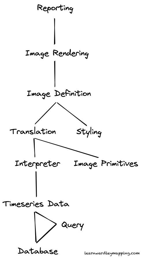
My understanding might be off, but the above is how I think “data visualization” might work. I’m filling in some gaps with guesses… For instance, I’m assuming the point of data visualization is to enable some kind of Reporting function.
Imagine that in order for us to provide our reporting, we need some kind of rendered image. (This could be the browser rendering the image for us dynamically, or maybe it could be a literal jpg or png image file.)
In order to render the image, the renderer needs to understand the instructions of what to render, which is described by the Image Definition
Meanwhile, all the way below, a query to the database results in data structured for visualization. For example, it might be a set of Timeseries Data.
Another component, the Interpreter, reads in the timeseries data and readies it for Translation into an Image Definition. That Translator takes the output from the Interpreter and uses definitions of Image Primitives (e.g., circles, squares, etc.) to produce that Image Definition.
Lastly, the Image Definition itself depends on some kind of Styling (let’s say, colors, margins, and so on… whatever makes the design people happy).
(Reminder: this might not be how this system works at all… BUT it’s the model for the system that I have in my head… so let’s roll with it!)
Now… How could you enrich this map so you can have a discussion about Software X or maybe Software Y and whether either one can do what you need?
Well, you would need to discuss them in terms of whether and how well they fulfill each of these different functions we’ve identified in the value chain.
Maybe this is what Software X does:

As you can see, we’ve drawn a boundary around the parts that Software X handles. We might decide to call this “Data Visualization,” too.
But maybe Software Y also handles Reporting in addition to Data Visualization:

So we can draw the boundary differently, highlighting which things are within the scope of Software Y. (This is similar to how you might draw boundaries around different components to highlight which team is working on what in an org design application of Wardley Mapping.)
but if that’s not important… then I do think this kind of simple representation is fine. It’s like saying “this value chain needs Data Visualization, and an instance of that is Software X.”

Furthermore, you can place specific instances along the evolution axis in order to deepen your understanding how each Software option approaches each part of the system. The super simple version of this kind of comparison is shown below.

“Software V treats data visualization like it’s a brand new thing… but Software X, Y, and Z seem to treat it like it’s much more understood… What does that tell us?”
Returning to the comparison of different software options… you can again zero in to each component and compare them at that our more detailed level of specificity.

As you can see, this level of specificity helps us appreciate exactly what kind of situation we’re dealing with.
You might, for example, see that there are very specific tradeoffs to be made. For example, let’s say a different option, Software W, does Reporting in addition to Visualization (yay!), but then you find out that its Translation, Interpeter, and Image Primitives are custom built, error-prone, and unreliable (boo!).

Comparing the one value chain to the other in this way can certainly change your view of the tradeoffs between Software X and Software W!
So returning to the original question… in my opinion, option #1 in your image (generic components intermingled with specific instances) is okay, #2 is better, but I prefer a slightly more detailed view IF the component (in this case, Data Visualization) is important to understand and get right.
My second question is about dependencies. Please look at the picture below. For the same data visualization feature I also need a DB and of course data. Which is for your experience the most appropriate among the 3 options? Thanks!!!

For this second question, we’ve got some interesting challenges. We have to get clear and sufficiently specific on what the parts are, as well as what relationships there are between the parts.
This is where maybe it makes sense to use option #2 from your first question, so we’re not mixing the ontologies (in other words… so we’re not having generic things and specific instances of that same thing in the same map… otherwise we might end up with a LOT of lines going every which way, which makes the map hard to use).
One trick we can use is to think about the map in terms of transactions. What is being passed around the system? From where, and to where?
Excluding instance of the component (i.e., “Software X”) for a moment… you already have an initial list of parts: Visualization, Data, and Database.
Let’s pretend you don’t have any relationships defined.
Then let’s go through each part, one by one, and ask these questions…
1) what is this made of?
2) what does it depend on?
3) what depends on it?
It might look something like this:

Do this for each component, and you’ll very quickly see what depends on what else and how all the relationships fit together.
In my original example all the way up above, I decided to represent it like the below, but you might choose something different.

I clarified that “Data” is “Timeseries Data” (increasing specificity of the language I’m using), and then also added “Query” (because I felt that was missing).
I decided that Visualization doesn’t care about the Database… it only cares about the Timeseries Data itself. I also decided that the Query itself depends on the Database (since the database decides which kinds of query are valid).
But that’s just one way to do it. I am making MANY assumptions that might not be valid. And you will have a clearer view on your situation. But I hope this gives you some ideas!
In general, don’t worry about whether your map looks exactly like mine. Instead, decide whether the way you’re doing it is working for you. If it’s useful, keep doing it. If it’s not useful, then try something else. (I happen to have tried a lot of things, so I usually have ideas… but even I haven’t tried everything! 😉)